RWD Responsive Web Design Complete Guide 2026: Essential Techniques for Every Developer
Quick Answer
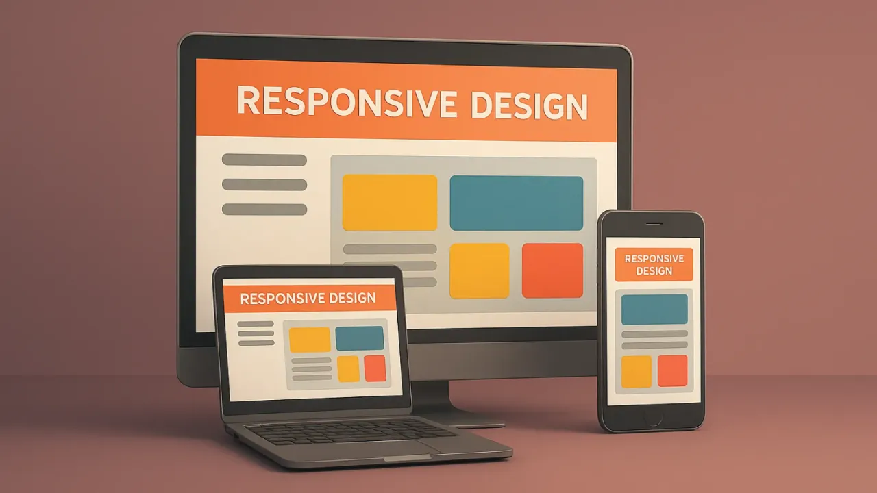
RWD (Responsive Web Design) refers to websites that can automatically adapt to different device screen sizes, providing optimized user experience on mobile phones, tablets, computers, and other devices. It's Google's recommended web development standard.
What is RWD Responsive Web Design?
RWD (Responsive Web Design), or what Google calls responsive web design, literally means websites that respond to your current device interface size to adjust display content.
Such websites can be easily browsed on devices ranging from small smartphones and tablets to laptops, desktop computers, and even larger devices without interference.
Are you still frustrated with decades-old websites displaying ant-sized fonts on mobile phones? Or tired of content looking strange on large display devices during presentations?
Five Major Benefits of Creating RWD
Creating RWD not only solves the above frustrations but also brings many practical benefits:
1. Improve User Experience, Avoid Customer Loss
Websites that respond to various devices—in an era of high mobile device dependency where many people shop and search for information via smartphones—allow easy viewing of product or service information, preventing customers from leaving the website due to overly small fonts or uncomfortable viewing environments.
2. Save Development Costs
Creating RWD websites eliminates the need to create separate mobile pages or apps, saving double the costs! One codebase can adapt to all devices.
3. SEO Ranking Advantages
Google includes website RWD and user experience in SEO scoring. RWD can increase user-friendly environments, directly affecting search rankings.
4. Simpler Maintenance
Only one website codebase needs maintenance, eliminating separate updates for desktop and mobile versions, significantly reducing maintenance costs and time.
5. Future Device Compatibility
As new devices continuously emerge (like foldable phones, various tablet sizes), RWD design can automatically adapt without additional development.
Core Technologies of RWD Design
1. Fluid Grid
Use percentages instead of fixed pixels to design grid systems:
.container {
  width: 100%;
  max-width: 1200px;
  margin: 0 auto;
}

.column {
  width: 50%; /* Use percentages */
  float: left;
}
2. Flexible Images
Make images adapt to container sizes:
img {
  max-width: 100%;
  height: auto;
}
3. Media Queries
Apply different styles for different screen sizes:
/* Mobile */
@media screen and (max-width: 768px) {
  .column {
    width: 100%;
    margin-bottom: 20px;
  }
}

/* Tablet */
@media screen and (min-width: 769px) and (max-width: 1024px) {
  .column {
    width: 48%;
  }
}
4. Viewport Meta Tag
Add viewport settings to HTML head:
<meta name="viewport" content="width=device-width, initial-scale=1.0">📱 RWD Responsive Layout Live Demo
🎛️ Real-time Device Switching Experience
Click the buttons below to see how the website adapts to different device sizes in real-time
💡 Key Observations:
• Mobile: Single-column layout, navigation hidden with hamburger menu
• Tablet: Two-column layout, more compact content
• Desktop: Three-column layout, full utilization of screen space
Common RWD Breakpoint Settings
Based on mainstream market devices, we recommend using the following breakpoints:
/* Extra small devices (portrait phones) */
@media (max-width: 575px) { ... }

/* Small devices (landscape phones) */
@media (min-width: 576px) and (max-width: 767px) { ... }

/* Medium devices (tablets) */
@media (min-width: 768px) and (max-width: 991px) { ... }

/* Large devices (desktops) */
@media (min-width: 992px) and (max-width: 1199px) { ... }

/* Extra large devices (large desktops) */
@media (min-width: 1200px) { ... }
Mobile First Design Principle
Recommend starting design from mobile, then expanding to larger screens:
/* Default mobile styles */
.navigation {
  display: block;
}

/* Horizontal navigation for tablet and above */
@media (min-width: 768px) {
  .navigation {
    display: flex;
  }
}
⚡ CSS Grid vs Flexbox Responsive Comparison
💡 Technology Comparison:
• CSS Grid: Suitable for two-dimensional layouts, precise row and column control
• Flexbox: Suitable for one-dimensional layouts, automatic space distribution
• Auto Responsive: Automatically adjusts column count based on minimum width
RWD and SEO Relationship
Google has many scoring standards for SEO. If you can’t meticulously adjust every item that needs optimization, then start improving traffic from the most basic RWD website!
Google’s Mobile-First Indexing
Since 2021, Google primarily uses mobile content for indexing and ranking:
- Single URL: RWD uses the same URL, avoiding duplicate content issues
- User Experience Metrics: Page loading speed and interactivity are ranking factors
- Mobile-Friendly Testing: Google provides tools to test website mobile-friendliness
Core Web Vitals Metrics
Google’s Core Web Vitals directly affect SEO:
- LCP (Largest Contentful Paint): Should be less than 2.5 seconds
- FID (First Input Delay): Should be less than 100 milliseconds
- CLS (Cumulative Layout Shift): Should be less than 0.1
RWD design helps improve these metrics and boost search rankings.
RWD Implementation Best Practices
1. Design Phase Planning
- Content First: Determine content to display before considering layout
- Breakpoint Selection: Based on natural content breaks, not device sizes
- Touch-Friendly: Button size minimum 44px x 44px
2. Development Techniques
Use CSS Grid and Flexbox:
.grid-container {
  display: grid;
  grid-template-columns: repeat(auto-fit, minmax(300px, 1fr));
  gap: 20px;
}
Responsive Font Sizes:
body {
  font-size: clamp(16px, 2.5vw, 24px);
}
3. Performance Optimization
- Image Optimization: Use
<picture>tag for different sized images - CSS Minification: Remove unused CSS
- Asynchronous JavaScript Loading: Avoid blocking page rendering
4. Testing and Validation
Multi-Device Testing:
- Chrome DevTools device simulation
- Real device testing
- Google PageSpeed Insights
- Mobile-Friendly Test
Common RWD Design Mistakes
1. Ignoring Touch Experience
- Buttons too small, difficult to click
- Insufficient link spacing
- Ignoring swipe operations
2. Improper Image Handling
- Images too large, slow loading
- Images compressed and distorted
- No high-resolution versions provided
3. Wrong Content Strategy
- Hiding important content on small screens
- Unclear information hierarchy
- Navigation too complex
4. Performance Issues
- Loading unnecessary resources
- Overly complex CSS
- Unoptimized font loading
🔍 RWD Testing Tool Simulator
💡 Recommended Tools:
• Google Mobile-Friendly Test: Test website mobile device compatibility
• PageSpeed Insights: Analyze website loading performance and user experience
• Chrome DevTools: Built-in device simulator, real-time responsive effect preview
Future Trends and Recommendations
Emerging Technologies
- Container Queries: Adjust styles based on container size
- CSS Subgrid: More flexible grid layouts
- Variable Fonts: Variable fonts reduce loading time
Design Trends
- Minimalism: Reduce visual noise, improve loading speed
- Dark Mode: Save power, enhance user experience
- Micro-interactions: Enhance user feedback
By implementing RWD responsive web design, you can not only provide excellent user experience but also effectively improve SEO rankings and website traffic. In the mobile-dominated era, RWD is no longer optional but a basic website requirement!