How to Create Multi-level Dropdown Menus: Complete Guide to Three-Tier Navigation
Why Multi-level Dropdown Menus?
How do you create effective three-tier dropdown menus? There are many different dropdown styles online, but finding the right one for your specific needs can be challenging.
Today we’ll explore three distinct menu approaches to help you choose the most suitable method and get started right away! These menus will make your website navigation simpler and more efficient.
Types of Multi-level Dropdown Menus
Based on expansion direction and use case, we provide three main dropdown menu designs:
1. Vertical Expansion (Downward)
Perfect for horizontal navigation bars, commonly used in website headers
2. Horizontal Expansion (Rightward)
Ideal for sidebar navigation, saving vertical space
3. Mixed Expansion (Down + Right)
Combines both approaches, suitable for complex multi-level navigation
Method 1: Vertical Expansion Dropdown
This approach works best for website header navigation with intuitive user interaction.
Key Features:
- Vertical expansion following natural reading patterns
- Perfect for desktop website headers
- Clear structure with obvious hierarchy
HTML Structure Essentials:
<ul class="dropdown-menu">
  <li class="dropdown-item">
    <label for="level1-checkbox">Level 1</label>
    <input id="level1-checkbox" type="checkbox" class="hidden" />
    <ul class="submenu">
      <li class="submenu-item">
        <label for="level2-checkbox">Level 2</label>
        <input id="level2-checkbox" type="checkbox" class="hidden" />
        <ul class="sub-submenu">
          <li>Level 3</li>
        </ul>
      </li>
    </ul>
  </li>
</ul>
Key CSS Settings:
.submenu {
display: none; /* Hidden by default */
}
.dropdown-item input:checked + .submenu {
display: block; /* Show when checked */
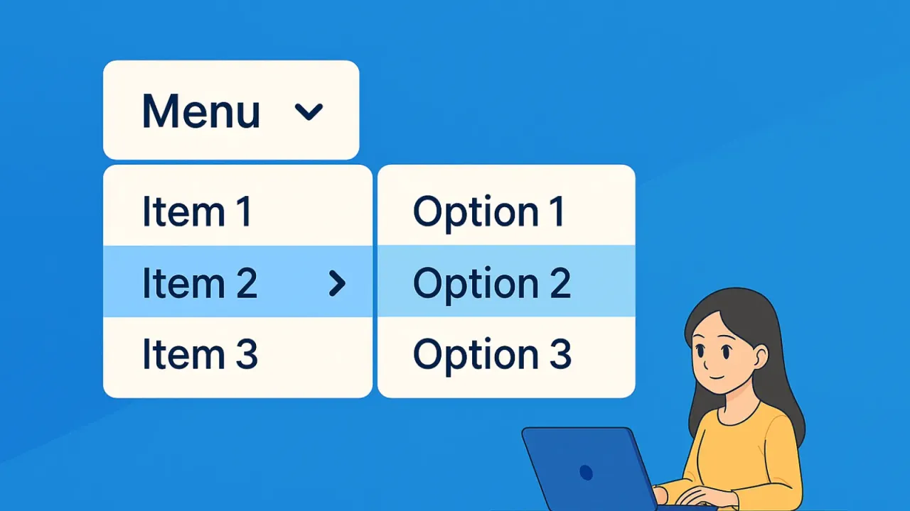
}📱 Method 1: Vertical Expansion Dropdown Demo
💡 Usage Tip: Hover over menu items to expand dropdown menus. Expansion direction is “downward + rightward” mixed expansion
Method 2: Horizontal Expansion Dropdown
This approach works well for sidebar navigation, effectively utilizing horizontal space.
Key Features:
- Horizontal expansion, saving vertical space
- Perfect for sidebars or mobile device navigation
- Clear visual hierarchy
Key CSS Settings:
.submenu {
  position: absolute;
  top: 0;
  left: 100%; /* Expand to the right */
  display: none;
}

.dropdown-item:hover .submenu,
.dropdown-item input:checked + .submenu {
  display: block;
}
Implementation Tips:
- Use
position: absolutefor submenu positioning left: 100%makes the menu expand to the right- Can be combined with
z-indexfor layering control
↗️ Method 2: Horizontal Expansion Dropdown Demo
💡 Usage Tip: Hover over left sidebar menu items and submenus will expand rightward. Perfect for sidebars and admin systems
Method 3: Mixed Expansion Dropdown
Combines the advantages of both vertical and horizontal expansion, suitable for complex navigation structures.
Key Features:
- First level expands downward
- Second and third levels expand rightward
- Ideal for content-rich large websites
Implementation Logic:
/* First level: downward expansion */
.level1-submenu {
  position: static;
  display: none;
}

/* Second and third levels: rightward expansion */
.level2-submenu, .level3-submenu {
  position: absolute;
  top: 0;
  left: 100%;
  display: none;
}
Use Cases:
- E-commerce product categories
- Corporate service portfolios
- Complex admin systems
🎯 Method 3: Mixed Expansion Dropdown Demo (Mobile Optimized)
💡 Usage Tip: Click menu items to expand submenus. First level expands downward, second and third levels use vertical expansion to save space - perfect for mobile devices
Implementation Technical Points
HTML Structure Design
Use semantic tags:
<nav class="main-navigation">
  <ul class="nav-list">
    <li class="nav-item has-dropdown">
      <a href="#" class="nav-link">Main Item</a>
      <ul class="dropdown-menu">
        <!-- Sub items -->
      </ul>
    </li>
  </ul>
</nav>
Core CSS Techniques
1. Show/Hide Control:
.dropdown-menu {
  opacity: 0;
  visibility: hidden;
  transform: translateY(-10px);
  transition: all 0.3s ease;
}

.has-dropdown:hover .dropdown-menu {
  opacity: 1;
  visibility: visible;
  transform: translateY(0);
}
2. Arrow Indicators:
.nav-link::after {
  content: '';
  border: solid transparent;
  border-width: 4px 4px 0;
  border-top-color: currentColor;
}
JavaScript Enhancement
Add keyboard support:
// Keyboard navigation support
document.addEventListener('keydown', (e) => {
  if (e.key === 'Escape') {
    closeAllDropdowns();
  }
});
User Experience Optimization Tips
Responsive Design
Desktop vs Mobile:
- Desktop: Use hover triggers, support mouse interaction
- Mobile: Use click triggers, consider touch-friendly design
Accessibility Design
Keyboard navigation support:
<li class="nav-item" role="menuitem">
  <a href="#" aria-haspopup="true" aria-expanded="false">
    Main Item
  </a>
</li>
Performance Considerations
CSS Optimization:
- Use
transforminstead oftop/leftfor animations - Avoid excessive
box-shadowthat impacts performance - Use
will-changeproperty judiciously
Visual Feedback
Interactive state design:
.nav-link:hover {
  background-color: #f5f5f5;
  color: #333;
}

.nav-link:focus {
  outline: 2px solid #007bff;
  outline-offset: 2px;
}
Choose the Right Solution
Decision Guidelines
Choose vertical expansion (downward) when:
- Website uses horizontal top navigation
- Content hierarchy doesn’t exceed 3 levels
- Desktop devices are the primary user base
Choose horizontal expansion (rightward) when:
- Using sidebar navigation design
- Need to save vertical space
- Mobile-first design approach
Choose mixed expansion when:
- Navigation content is complex with many levels
- Large websites need comprehensive navigation structure
- Have sufficient development time and resources
With these three multi-level dropdown menu creation methods, you can choose the most suitable navigation approach based on your project requirements, creating smooth and user-friendly website navigation experiences!