HTML Popover API: Build Tooltips and Dropdowns Without JavaScript
Quick Answer
Add a popovertarget attribute to your trigger element and a popover attribute to your target element. No JavaScript required — the browser handles outside-click dismissal, Esc key, and accessibility focus management automatically.
What Is the Popover API? How Is It Different From dialog?
Building a tooltip, dropdown, or notification used to require:
- Toggling
display: none / blockmanually - Listening for outside clicks to dismiss
- Wrestling with
z-indexto keep it on top - Adding aria attributes for accessibility
The Popover API makes all of that native browser behavior — one attribute and you’re done.
The difference from <dialog> is clear:
<dialog> | popover | |
|---|---|---|
| Purpose | Blocking modal | Non-blocking overlay |
| Background | Locked, no interaction | Remains interactive |
| Use cases | Confirmations, forms, alerts | Tooltips, dropdowns, notifications |
Browser support: Chrome 114+, Safari 17+, Firefox 125+ — approximately 93% globally. Safe for production use.
Basic Syntax: One Line of HTML
The simplest implementation requires no JavaScript at all:
<button popovertarget="my-tip">Show Info</button>

<div id="my-tip" popover>
  Popover content here
</div>popovertarget: points to the target element’s id — clicking toggles it open/closedpopover: marks this element as a popover, defaults topopover="auto"
The browser handles automatically:
- Outside-click dismissal
- Esc key to close
- Top Layer rendering (above all z-index stacking)
- Accessibility attributes (aria-expanded, aria-controls)
Basic Popover Toggle
This is a native Popover. Click outside or press Esc to close. No JavaScript needed.
auto vs manual: Two Behavior Modes
popover comes in two modes:
<!-- auto: dismisses on outside click (default) -->
<div id="tip-auto" popover>Content</div>

<!-- manual: only closes via JS or a button -->
<div id="tip-manual" popover="manual">Content</div>
auto mode:
- Dismisses on outside click
- Only one can be open at a time — opening a new one closes the previous
- Esc key closes it
manual mode:
- Outside clicks do nothing
- Multiple can be open simultaneously
- You control closing explicitly
Use auto for most cases. Use manual for toast notifications or situations where multiple popovers need to coexist.
auto vs manual Behavior
auto mode: click anywhere outside to dismiss.
manual mode: clicking outside does nothing. Use the button to close.
Controlling Popover With JavaScript
You can also control popovers programmatically:
const popover = document.getElementById('my-popover');

popover.showPopover();   // show
popover.hidePopover();   // hide
popover.togglePopover(); // toggle
Listen for open/close events:
popover.addEventListener('toggle', (e) => {
  if (e.newState === 'open') {
    console.log('popover opened');
  } else {
    console.log('popover closed');
  }
});
This is especially useful for notification systems — manual mode with a toggle listener lets you build auto-dismissing toast notifications cleanly.
Auto-Dismissing Toast Notification
A toast appears and auto-dismisses after 3 seconds
✓ Changes saved successfully!
CSS Entrance and Exit Animations
Popovers appear instantly by default, but you can add smooth animations using :popover-open and @starting-style:
[popover] {
  opacity: 0;
  transform: translateY(8px);
  transition: opacity 0.25s ease, transform 0.25s ease,
              display 0.25s allow-discrete,
              overlay 0.25s allow-discrete;
}

[popover]:popover-open {
  opacity: 1;
  transform: translateY(0);
}

@starting-style {
  [popover]:popover-open {
    opacity: 0;
    transform: translateY(8px);
  }
}
The allow-discrete on display and overlay is the key — it enables exit animations so the popover fades out instead of disappearing instantly.
Dropdown With Entrance and Exit Animation
Notice both the open and close animations
::backdrop and Styling
Like <dialog>, popover="auto" also has a ::backdrop — but it’s transparent by default. Add a subtle overlay if needed:
[popover]::backdrop {
  background: rgba(0, 0, 0, 0.2);
}
You can also style the trigger button based on whether its popover is open using :popover-open:
/* Style the trigger button when its popover is open */
button:has(+ [popover]:popover-open) {
  background: #e0e7ff;
}
FAQ
Q: When should I use popover vs dialog?
- User must respond before continuing (confirmations, forms) →
<dialog showModal()> - Non-blocking overlay (hints, menus, notifications) →
popover
Q: Can I control the position of the popover with CSS?
By default, popovers appear centered on screen. For precise positioning, CSS Anchor Positioning (anchor-name / position-anchor) is the native solution, but browser support is currently limited to Chrome. For cross-browser use, calculate position with JavaScript.
Q: What about older browsers?
if (!HTMLElement.prototype.showPopover) {
  // fall back to dialog or custom logic
}
At 93% support, most projects can use it directly. Add a polyfill if your audience requires broader compatibility.
Conclusion
The Popover API fills a gap that has existed for years — a native, non-blocking overlay layer between fully custom and the forced modal of <dialog>.
Good use cases:
- Tooltips: show extra info on hover or click
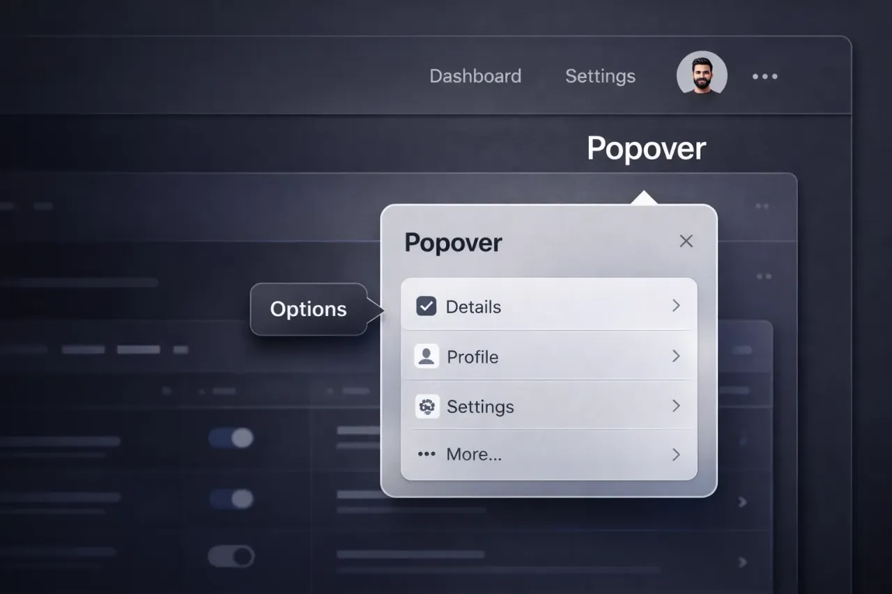
- Dropdown menus: account, settings, filters
- Toast notifications: success and error feedback
- Floating toolbars: color pickers, format panels
Not the right tool for:
- Confirmations that require a user decision → use
<dialog> - Complex form modals → use
<dialog>
For new projects, the Popover API should be your default choice for any floating UI — no Bootstrap dropdown, no custom overlay logic from scratch.