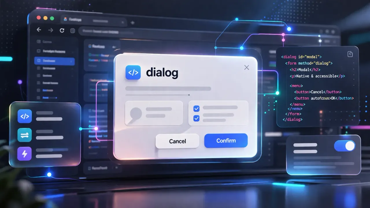
HTML Native dialog Element: Build Professional Modals Without Any Library
Quick Answer
Wrap your content in a dialog tag, then use JavaScript's showModal() to open and close() to close it. No libraries needed — the browser handles accessibility and the ::backdrop overlay for you.
Still Building Modals From Scratch? The Browser Already Did It For You
The old way of building a modal required:
- A custom
.overlaydiv to block the background - JavaScript to toggle
display: none / block - Manually locking background scroll
- Listening for the Esc key yourself
- Handling accessibility — focus trap, aria attributes
Now? The native HTML <dialog> handles all of that with a single element.
Browser support is over 96% — Chrome, Firefox, Safari, and Edge all support it. You can safely use it in production today.
Basic Syntax: Opening and Closing
The core of <dialog> is straightforward — just two JavaScript methods to remember:
<dialog id="my-modal">
  <p>Modal content goes here</p>
  <button id="close-btn">Close</button>
</dialog>

<button id="open-btn">Open Modal</button>
const modal = document.getElementById('my-modal');
document.getElementById('open-btn').addEventListener('click', () => {
modal.showModal(); // Opens modal with backdrop
});
document.getElementById('close-btn').addEventListener('click', () => {
modal.close(); // Closes modal
});showModal() vs show()
| Method | Behavior |
|---|---|
showModal() | Full-screen modal with ::backdrop, locks focus, Esc key closes |
show() | Non-blocking popup, no backdrop, focus not locked |
Use showModal() for modals that require user attention. Use show() for tooltips or floating panels.
Basic Modal Open / Close
::backdrop: Customizing the Overlay
When opened with showModal(), the browser automatically creates a ::backdrop pseudo-element behind the modal. Style it directly with CSS:
dialog::backdrop {
  background: rgba(0, 0, 50, 0.6);
  backdrop-filter: blur(8px);
}
The frosted-glass overlay effect that used to require stacking multiple divs? One line of CSS now.
Custom ::backdrop Frosted Glass Effect
Form Integration: method='dialog'
This is one of <dialog>’s most underrated features: set a <form>’s method to "dialog" and submitting it will automatically close the dialog and capture which button was clicked — no JavaScript needed for confirm/cancel logic.
<dialog id="confirm-modal">
  <p>Are you sure you want to delete this?</p>
  <form method="dialog">
    <button value="cancel">Cancel</button>
    <button value="confirm">Delete</button>
  </form>
</dialog>modal.addEventListener('close', () => {
// returnValue is the value of the clicked button
if (modal.returnValue === 'confirm') {
// run delete logic
}
});Confirm Dialog
Entrance Animation: @starting-style
By default, <dialog> appears instantly with no animation. Pair it with @starting-style to create a pure CSS entrance animation — no JavaScript class toggling needed.
dialog[open] {
  opacity: 1;
  transform: translateY(0);
  transition: opacity 0.3s ease, transform 0.3s ease;
}

@starting-style {
  dialog[open] {
    opacity: 0;
    transform: translateY(-16px);
  }
}
@starting-style defines the element’s initial state the moment it appears. The transition then animates it to the dialog[open] styles. Pure CSS, zero JavaScript.
Browser support: Chrome 117+, Firefox 129+, Safari 17.5+ — covering over 90% of users.
Full Modal With Entrance Animation
Watch the entrance animation
FAQ
Q: Can clicking the backdrop close the modal?
Native <dialog> doesn’t support this by default. Add it yourself:
modal.addEventListener('click', (e) => {
  if (e.target === modal) modal.close();
});
Q: Can I prevent the Esc key from closing the dialog?
modal.addEventListener('cancel', (e) => {
  e.preventDefault();
});
Q: What are the downsides compared to Bootstrap modal?
- Exit animations require extra work (
@starting-stylecurrently only handles entrance) - No built-in “click backdrop to close” behavior
- Migration from existing implementations takes some effort
That said, for new projects the native <dialog> wins: zero dependencies, built-in accessibility, and better performance.
Conclusion: Is It Worth Switching?
If you’re still building modals with:
- Bootstrap modal
- A hand-rolled div overlay
- jQuery UI dialog
It’s time to switch. The case for <dialog> is clear:
- Accessibility for free: focus trap and aria attributes managed automatically
- Esc key built in: no event listener needed
- Background scroll lock:
showModal()handles it - ::backdrop: one line of CSS for the overlay
- Zero dependencies: no library required
For new projects, <dialog> should be your default choice. Keep Bootstrap modal only for legacy projects that need backward compatibility.