CSS Shape Guide: 15 Geometric Shapes Creation Ultimate Tutorial
Why Learn to Draw Shapes with CSS?
Imagine if you could draw beautiful shapes with pure code without needing any image files - wouldn’t that be amazing?
CSS Shape Superpowers:
- Zero file size: No image loading required, blazing fast websites ⚡
- Perfect scaling: Crystal clear at any size, never blurry 🎯
- Dynamic control: Control colors, sizes, animations with code 🎨
- Unlimited creativity: Combine basic shapes to create unique visual effects ✨
Real-world Applications:
- Creating logos and icons
- Designing decorative elements
- Creating geometric background patterns
- Making loading animation effects
The skills you’re about to learn will evolve you from “using existing images” to “creating unique visuals” as a designer!
CSS Drawing Fundamentals (Core Concepts)
The Magic Border Trick
The biggest secret of CSS drawing: borders are not just borders, they can become part of the shape!
/* A magical experiment */
.border-demo {
  width: 0;
  height: 0;
  border: 50px solid;
  border-color: red blue green yellow;
}
What does this create? Four triangles! This is how CSS triangles are born.
Core Toolkit
Main tools for creating CSS shapes:
- border - Border transformation magic
- border-radius - Rounded corner wizardry
- transform - Rotate, skew, scale
- clip-path - Modern cutting-edge tool
- Pseudo-elements (::before, ::after) - Add extra elements
🔬 Border Principle Laboratory
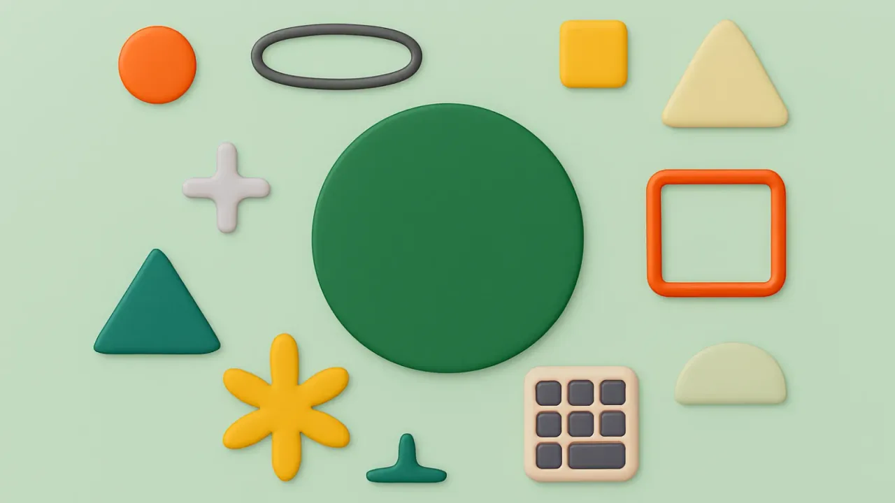
Basic Shape Creation Techniques
1. Circle Family (Simplest Start)
Perfect Circle:
.circle {
  width: 100px;
  height: 100px;
  background: #ff6b6b;
  border-radius: 50%;
}
Ellipse:
.ellipse {
  width: 120px;
  height: 80px;
  background: #4ecdc4;
  border-radius: 50%;
}
2. Triangle Kingdom (Border Magic)
Upward Triangle:
.triangle-up {
  width: 0;
  height: 0;
  border-left: 50px solid transparent;
  border-right: 50px solid transparent;
  border-bottom: 80px solid #45b7d1;
}
Right Triangle:
.triangle-right {
  width: 0;
  height: 0;
  border-top: 50px solid transparent;
  border-bottom: 50px solid transparent;
  border-left: 80px solid #f9ca24;
}
🎨 Basic Shape Gallery
Advanced Polygon Techniques
Hexagon Creation Method
Hexagons are very popular in web design, commonly used for honeycomb layouts:
.hexagon {
  width: 100px;
  height: 55px;
  background: #4ecdc4;
  position: relative;
}

.hexagon:before,
.hexagon:after {
  content: "";
  position: absolute;
  width: 0;
  border-left: 50px solid transparent;
  border-right: 50px solid transparent;
}

.hexagon:before {
  bottom: 100%;
  border-bottom: 25px solid #4ecdc4;
}

.hexagon:after {
  top: 100%;
  border-top: 25px solid #4ecdc4;
}
Five-pointed Star Creation
Five-pointed stars require clip-path, a powerful modern CSS feature:
.star {
  width: 100px;
  height: 100px;
  background: #f9ca24;
  clip-path: polygon(50% 0%, 61% 35%, 98% 35%, 68% 57%, 79% 91%, 50% 70%, 21% 91%, 32% 57%, 2% 35%, 39% 35%);
}
⭐ Advanced Polygon Crafts
Real-world CSS Shape Applications
1. Logo Design
The advantage of using CSS shapes for logos is perfect scaling and fast loading:
.logo {
  position: relative;
  width: 100px;
  height: 100px;
}

.logo-circle {
  width: 100%;
  height: 100%;
  background: linear-gradient(45deg, #667eea, #764ba2);
  border-radius: 50%;
}

.logo-inner {
  position: absolute;
  top: 50%;
  left: 50%;
  transform: translate(-50%, -50%);
  width: 60px;
  height: 60px;
  background: white;
  border-radius: 50%;
}
2. Decorative Geometric Patterns
.decoration {
  display: grid;
  grid-template-columns: repeat(4, 1fr);
  gap: 10px;
}

.decoration-item {
  width: 50px;
  height: 50px;
  background: linear-gradient(45deg, transparent 40%, #4ecdc4 40%, #4ecdc4 60%, transparent 60%);
  animation: spin 4s linear infinite;
}
3. Loading Animations
.loader {
  position: relative;
  width: 50px;
  height: 50px;
}

.loader-dot {
  position: absolute;
  width: 10px;
  height: 10px;
  background: #667eea;
  border-radius: 50%;
  animation: loader-pulse 1.5s ease-in-out infinite;
}

@keyframes loader-pulse {
  0%, 100% { transform: scale(0.8); opacity: 0.5; }
  50% { transform: scale(1.2); opacity: 1; }
}
🚀 Real-world Application Showcase
Modern CSS New Technique: clip-path
clip-path is the most powerful shape tool in modern CSS, capable of clipping any shape you can imagine!
Basic clip-path Syntax
/* Polygon */
clip-path: polygon(50% 0%, 100% 50%, 50% 100%, 0% 50%);

/* Circle */
clip-path: circle(50%);

/* Ellipse */
clip-path: ellipse(50% 40%);

/* Inset rectangle */
clip-path: inset(10px 20px 30px 40px);
Practical clip-path Shapes
/* Speech bubble */
.bubble {
  clip-path: polygon(0% 0%, 100% 0%, 100% 75%, 75% 75%, 75% 100%, 50% 75%, 0% 75%);
}

/* Arrow */
.arrow-right {
  clip-path: polygon(0% 20%, 60% 20%, 60% 0%, 100% 50%, 60% 100%, 60% 80%, 0% 80%);
}

/* Hexagon */
.hex-clippath {
  clip-path: polygon(25% 0%, 75% 0%, 100% 50%, 75% 100%, 25% 100%, 0% 50%);
}
Advantages:
- Concise syntax
- Excellent performance
- Animation support
- Can create complex shapes
Considerations:
- Check browser compatibility
- For simple shapes, traditional methods might be better
Shape Animations and Interactive Effects
CSS shapes combined with animations can create stunning effects:
Basic Animation Techniques
/* Rotation animation */
@keyframes spin {
  from { transform: rotate(0deg); }
  to { transform: rotate(360deg); }
}

/* Pulse effect */
@keyframes pulse {
  0%, 100% { transform: scale(1); }
  50% { transform: scale(1.2); }
}

/* Morphing animation */
@keyframes morph {
  0% { border-radius: 0; }
  50% { border-radius: 50%; }
  100% { border-radius: 0; }
}
Hover Interactive Effects
.shape-interactive {
  transition: all 0.3s ease;
}

.shape-interactive:hover {
  transform: scale(1.1) rotate(10deg);
  filter: hue-rotate(90deg);
  box-shadow: 0 10px 20px rgba(0,0,0,0.3);
}
Best Practices and Tips Summary
Performance Optimization
- Prioritize transform: Avoid triggering reflow
- Use will-change wisely: Pre-inform browser of animations
- Avoid over-complexity: Too many pseudo-elements affect performance
Compatibility Considerations
- Traditional methods most stable: border-radius + border tricks
- clip-path needs checking: Confirm target browser support
- Provide fallbacks: Important shapes should have backup options
Practical Suggestions
- Start simple: Master circles and triangles first
- Experiment more: Adjust values to see effect changes
- Combine creatively: Basic shapes can create new forms
- Consider maintenance: Complex CSS shapes need good comments
CSS Shapes vs Image Files
When to use CSS shapes: ✅ Simple geometric shapes ✅ Shapes that need scaling ✅ Shapes that need animation ✅ When loading speed is crucial
When to use image files: ✅ Complex illustrations or photos ✅ Brand logos (if very complex) ✅ Need precise pixel-level control
Start Your CSS Art Creation Journey
Recommended Learning Path:
- Week 1: Master circles, triangles, squares
- Week 2: Challenge hexagons, hearts, stars
- Week 3: Learn advanced clip-path techniques
- Week 4: Create your own geometric logo
Practice Suggestions:
- Create a new shape every day
- Try different color combinations
- Add simple animation effects
- Think about real-world applications
Sources of Inspiration:
- Observe geometric patterns in daily life
- Reference excellent website designs
- Try recreating interesting shapes you see
Creating art with code is not just a skill, but a whole new way of creating. Ready to become a CSS geometric art master? 🎨✨