CSS Flexbox Complete Guide 2026: Master Flexible Layouts Once and For All
Quick Answer
Flexbox is CSS's flexible layout system. Add `display: flex` to a parent element and its children automatically align in a flexible row or column. Use `justify-content` to distribute items along the main axis and `align-items` to align them on the cross axis.
Why Flexbox Changed Frontend Layout
Remember the float era? You’d float everything, then wrestle with clearfix, calculate negative margins just to vertically center something, and pray the last card didn’t drop to the next row due to a rounding error. It was genuinely painful.
Flexbox solved all of that.
Common layout frustrations before Flexbox:
- Vertical centering:
position: absolute+transform: translateY(-50%)just to center a div - Equal-height columns: required JavaScript to measure and set heights dynamically
- Even horizontal spacing: float percentages that broke due to sub-pixel rounding
- Reordering elements: no choice but to change the HTML structure
The Flexbox solution (just a few lines):
/* Vertical + horizontal centering — used to need 10 lines, now needs 3 */
.container {
  display: flex;
  justify-content: center; /* horizontal */
  align-items: center;     /* vertical */
}
The once-dreaded vertical centering problem is now three lines of CSS.
All modern browsers support Flexbox fully. If you also want your layouts to adapt across screen sizes, pair this with Responsive Web Design (RWD).
Two Core Roles: Container and Item
The single most important idea in Flexbox: it operates on two levels. The Container commands, the Items obey — and can also have their own flexible behavior.
Container — The Commander
.container {
  display: flex; /* This element is now a flex container */
}
Any element with display: flex becomes a Container. It decides how children are arranged, whether they wrap, and how space is distributed.
Item — The Soldier
/* Direct children of a Container automatically become Items */
<div class="container">
  <div>Item 1</div>  ← flex item
  <div>Item 2</div>  ← flex item
  <div>Item 3</div>  ← flex item
</div>
Only direct children become flex items. Grandchildren are unaffected.
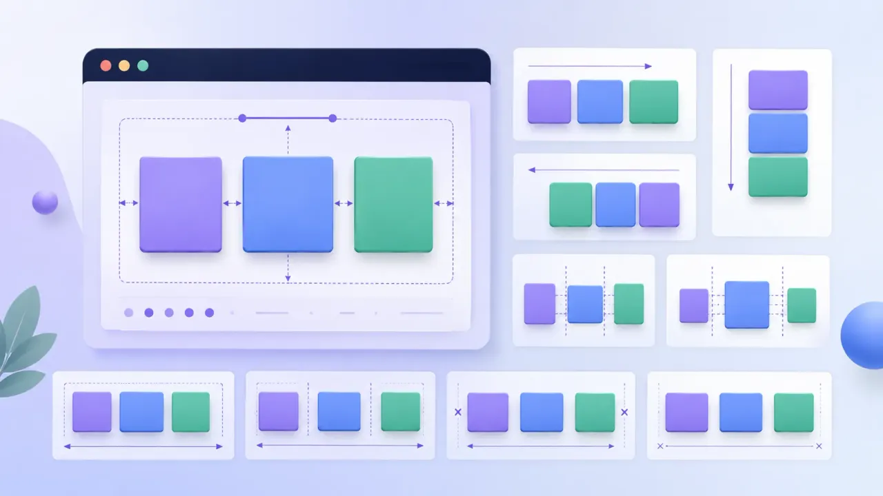
Main Axis and Cross Axis
Flex layout is driven by two perpendicular axes — this is the key to understanding every property:
- Main Axis: the direction flex items are placed
- Cross Axis: perpendicular to the main axis
/* Default: main axis horizontal (→), cross axis vertical (↓) */
.container { flex-direction: row; }

/* Switched: main axis vertical (↓), cross axis horizontal (→) */
.container { flex-direction: column; }
justify-content always controls the main axis. align-items always controls the cross axis. Lock this in and you’ll never mix them up.
Six Essential Container Properties
1. flex-direction (main axis direction)
flex-direction: row;            /* → left to right (default) */
flex-direction: row-reverse;    /* ← right to left */
flex-direction: column;         /* ↓ top to bottom */
flex-direction: column-reverse; /* ↑ bottom to top */
2. justify-content (main axis distribution)
One of the most-used properties — controls how items are distributed along the main axis:
justify-content: flex-start;    /* packed at the start (default) */
justify-content: flex-end;      /* packed at the end */
justify-content: center;        /* centered */
justify-content: space-between; /* first and last at edges, equal gaps between */
justify-content: space-around;  /* equal space on both sides of each item */
justify-content: space-evenly;  /* all gaps (including edges) perfectly equal */
Click the buttons below to see each value in action:
justify-content Interactive Demo
Current value: flex-start
3. align-items (cross axis alignment)
Controls how items align on the cross axis (vertical when flex-direction: row):
align-items: stretch;     /* items stretch to fill the container height (default) */
align-items: flex-start;  /* aligned to the start of the cross axis */
align-items: flex-end;    /* aligned to the end */
align-items: center;      /* centered on the cross axis */
align-items: baseline;    /* aligned by text baseline */
4. flex-wrap (line wrapping)
flex-wrap: nowrap;  /* no wrapping — items shrink to fit (default) */
flex-wrap: wrap;    /* items wrap onto new lines when they overflow */
5. gap (spacing between items)
Cleaner than adding margins to individual items — only creates space between items, not at the container edges:
gap: 1rem;         /* same gap in all directions */
gap: 1rem 2rem;    /* row-gap: 1rem, column-gap: 2rem */
6. flex-flow (shorthand)
Combines flex-direction and flex-wrap:
flex-flow: row wrap;      /* most common: horizontal + allow wrapping */
flex-flow: column nowrap; /* vertical, no wrapping */
Item Properties: Individual Flex Control
Container properties control the whole group. Item properties let individual children tune their own size and alignment.
flex-grow (growth ratio)
The number represents how much of the remaining free space this item claims. 0 means it claims none:
.item-a { flex-grow: 1; } /* claims 1 share */
.item-b { flex-grow: 2; } /* claims 2 shares (twice as much as a) */
.item-c { flex-grow: 0; } /* claims nothing, stays its natural size */
flex-shrink (shrink ratio)
When the container is too small, this controls how much each item shrinks. 0 means it won’t shrink:
.item { flex-shrink: 1; } /* default — shrinks proportionally */
.item { flex-shrink: 0; } /* won't shrink even if it overflows */
Set flex-shrink: 0 on logos and images to prevent them from being squashed.
flex-basis (initial size)
The item’s starting size before free space is distributed:
.item { flex-basis: 200px; } /* starts at 200px wide */
.item { flex-basis: auto; }  /* sized by content (default) */
.item { flex-basis: 0; }     /* ignores content size, starts from zero */
flex (the shorthand — use this)
The recommended way to write all three together:
.item { flex: 1; }           /* = flex: 1 1 0% — equal distribution of free space */
.item { flex: auto; }        /* = flex: 1 1 auto */
.item { flex: none; }        /* = flex: 0 0 auto — fixed size, no flexibility */
.item { flex: 0 0 200px; }   /* fixed at 200px, won't grow or shrink */
flex: 1 is the go-to for equal-width columns. Memorize it.
align-self (per-item alignment override)
Overrides the container’s align-items for a single item:
.special {
  align-self: flex-end; /* only this item aligns to the bottom */
}
order (display order)
Lower numbers appear first. Default is 0:
.item { order: -1; } /* pushed to the very front */
.item { order: 2; }  /* pushed toward the back */
Three Real-World Layout Patterns
Pattern 1: Centering (the most-used trick)
.center-box {
  display: flex;
  justify-content: center; /* horizontal */
  align-items: center;     /* vertical */
  height: 200px;
}
Flexbox Centering
Pattern 2: Navbar (logo left, links right)
.navbar {
  display: flex;
  justify-content: space-between; /* logo at start, button at end */
  align-items: center;
  padding: 0 1.5rem;
}
Flexbox Navbar
Pattern 3: Equal-height cards
No matter how much content each card has, align-items: stretch (the default) makes every card the same height:
.cards {
  display: flex;
  gap: 1rem;
}

.card {
  flex: 1; /* equal width */
  /* stretch (default) handles equal height automatically */
}
Equal-Height Cards
Notice all three cards are the same height even though their content lengths differ. That’s align-items: stretch at work — items fill the full height of the container.
Common Questions
Q: What’s the difference between flex: 1 and width: 100%?
A: flex: 1 means “claim an equal share of the remaining free space.” Multiple items with flex: 1 divide that space equally. width: 100% means “take up the full parent width,” which would cause items to stack on top of each other unless combined with flex-wrap: wrap.
For equal-width columns, use flex: 1. For an item that should take up a full row on its own, use flex-basis: 100%.
Q: justify-content has no effect — what’s wrong?
A: Check three things:
- Does the parent have
display: flex? - Is there actually free space? If items already fill the container, there’s nothing to distribute.
- Do items have
flex-grow: 1? That consumes all free space, leaving nothing forjustify-contentto work with.
Q: Flexbox vs CSS Grid — which should I use?
A: They’re complementary, not competing:
- Flexbox: one-dimensional (a row or a column) — navbars, button groups, a single row of cards
- CSS Grid: two-dimensional (rows and columns simultaneously) — full-page layouts, complex grids
In practice, most projects use both: Grid for the overall page structure, Flexbox for component-level layout.
Q: How do I switch to a vertical layout on mobile?
A: Change flex-direction inside a media query:
.container {
  display: flex;
  gap: 1rem;
}

@media (max-width: 768px) {
  .container {
    flex-direction: column;
  }
}
Flexbox Quick Reference
Container Properties
| Property | Common Values | Purpose |
|---|---|---|
display | flex | Enable Flexbox |
flex-direction | row / column | Main axis direction |
justify-content | center / space-between / space-evenly | Main axis distribution |
align-items | center / stretch / flex-end | Cross axis alignment |
flex-wrap | wrap / nowrap | Whether items wrap |
gap | 1rem | Space between items |
flex-flow | row wrap | Shorthand for direction + wrap |
Item Properties
| Property | Common Values | Purpose |
|---|---|---|
flex | 1 / none / 0 0 200px | Shorthand for grow + shrink + basis |
flex-grow | 0 / 1 | Growth ratio |
flex-shrink | 0 / 1 | Shrink ratio |
flex-basis | auto / 200px | Initial size |
align-self | center / flex-end | Override alignment for one item |
order | number | Display order — lower appears first |
Three patterns to memorize:
/* Center everything */
display: flex;
justify-content: center;
align-items: center;

/* Navbar: logo left, button right */
display: flex;
justify-content: space-between;
align-items: center;

/* Equal-width cards */
display: flex;
gap: 1rem;
.card { flex: 1; }
Once you’re comfortable with Flexbox, the natural next step is CSS Grid for two-dimensional layouts, or dive into Responsive Web Design (RWD) to make sure your layouts work flawlessly across every screen size.