CSS Filters Complete Guide: Transform Images into Artworks
Have you ever admired the stunning image effects on websites? You don’t need Photoshop or heavy image editing software – you can achieve amazing visual effects with just CSS!
The CSS filter property allows you to apply various visual effects to elements instantly, dynamically adjust image appearance without modifying original files, enhance user experience through hover interactions, and save development time without preprocessing images.
Let’s explore all CSS filter techniques through practical interactive examples!
Why Learn CSS Filters?
CSS filters revolutionize how we handle visual effects on the web. Unlike traditional image editing workflows, CSS filters provide:
Real-time Processing: Apply effects instantly without server-side processing Dynamic Control: Change effects based on user interactions or states Performance Benefits: Browser-optimized rendering with hardware acceleration Flexibility: Easily modify or remove effects without touching original assets Responsive Design: Effects adapt automatically to different screen sizes
Whether you’re building a photo gallery, enhancing UI interactions, or creating artistic visual effects, CSS filters are an essential tool in modern web development.
Essential Filter Effects
Let’s start with the most commonly used filter effects. Each effect has unique applications and can be combined for complex visual treatments.
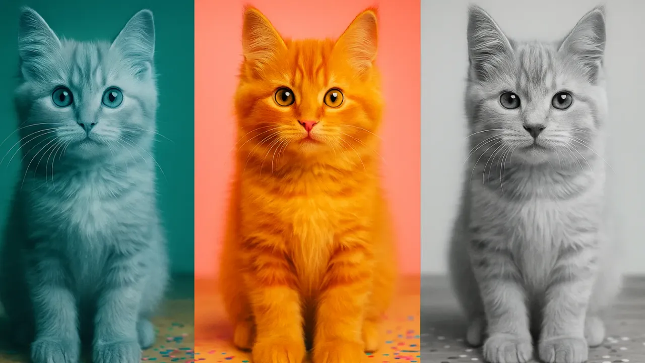
Essential Filter Effects Showcase

Essential Filter Effects Code Analysis
The example above demonstrates the powerful capabilities of CSS filters. Let’s examine each effect in detail:
HTML Structure
<div class="filter-item">
  <img src="image.jpg" alt="description" class="filter-image blur" />
  <div class="filter-label">Gaussian Blur</div>
  <div class="filter-value">filter: blur(3px)</div>
</div>
CSS Filter Syntax
/* Basic syntax */
.element {
  filter: filter-name(parameter-value);
}

/* Common filter effects */
.blur { filter: blur(3px); }                    /* Blur: higher values = more blur */
.brightness { filter: brightness(1.5); }        /* Brightness: 1 = original, >1 = brighter, <1 = darker */
.contrast { filter: contrast(1.5); }            /* Contrast: 1 = original, >1 = higher contrast */
.grayscale { filter: grayscale(100%); }         /* Grayscale: 0% = color, 100% = full grayscale */
.hue-rotate { filter: hue-rotate(90deg); }      /* Hue rotation: changes color hue */
.invert { filter: invert(100%); }               /* Color inversion: creates negative effect */
.opacity { filter: opacity(50%); }              /* Opacity: similar to opacity property */
.saturate { filter: saturate(2); }              /* Saturation: 1 = original, >1 = more vivid */
.sepia { filter: sepia(100%); }                 /* Sepia: vintage brown filter effect */
Interactive Enhancement
// Enhanced filter effect on hover
item.addEventListener('mouseenter', function() {
  if (img.classList.contains('blur')) {
    img.style.filter = 'blur(6px)';  // Enhance from 3px to 6px
  }
});

item.addEventListener('mouseleave', function() {
  img.style.filter = '';  // Reset to original effect
});
This design allows users to experience instantly the differences between filter effects, enhancing the learning experience.
Interactive Filter Controller
Static demonstrations are good, but letting users adjust filter parameters in real-time is even better! Let’s build a complete filter controller.
Real-time Filter Controller
Real-time Filter Controller
Drag sliders to adjust various filter effects and see results instantly!
Interactive Controller Implementation
This filter controller demonstrates how to dynamically manipulate CSS filters with JavaScript. Let’s analyze the key implementation details:
Core Data Structure
const filterControls = {
  blur: 0,           // Blur: 0-10px
  brightness: 100,   // Brightness: 0-200%
  contrast: 100,     // Contrast: 0-200%
  grayscale: 0,      // Grayscale: 0-100%
  hueRotate: 0,      // Hue rotation: 0-360deg
  invert: 0,         // Invert: 0-100%
  opacity: 100,      // Opacity: 0-100%
  saturate: 100,     // Saturation: 0-200%
  sepia: 0           // Sepia: 0-100%
};
Dynamic Filter Update Function
function updateFilter() {
  const img = document.getElementById('controllableImage');
  let filterString = '';

  // Only include non-default filters in the string
  if (filterControls.blur > 0) {
    filterString += `blur(${filterControls.blur}px) `;
  }

  if (filterControls.brightness !== 100) {
    filterString += `brightness(${filterControls.brightness / 100}) `;
  }

  // ... other filter processing

  // Apply to element
  img.style.filter = filterString.trim();
}
Slider Event Handling
slider.addEventListener('input', function() {
  filterControls[property] = parseInt(this.value);

  // Update display value (with appropriate units)
  let displayValue = this.value;
  if (property === 'hueRotate') {
    displayValue += 'deg';
  } else if (property === 'blur') {
    displayValue += 'px';
  } else {
    displayValue += '%';
  }

  valueDisplay.textContent = displayValue;
  updateFilter();  // Update effect immediately
});
Practical Features
- Reset Function: One-click restore of all filters to default values
- Random Effects: Generate random filter combinations for creative inspiration
- Live CSS Output: Display complete CSS code for current effects
This interactive learning approach allows you to intuitively understand the role of each filter parameter, making it easier to master than static documentation.
Advanced Filter Techniques & Real-world Applications
After mastering basic filters, let’s explore advanced techniques and practical application scenarios.
Advanced Filter Applications
Combine transform and filter for professional hover interactions
Dynamic filter style switching, perfect for portfolios or product displays
Filters aren’t just for images - text effects can be stunning too
GLITCH EFFECT
Advanced Filter Techniques Code Analysis
The examples above demonstrate advanced filter applications in real projects. Let’s examine the implementation details:
Enhanced Hover Effects
.hover-image {
  filter: brightness(0.8) contrast(1.2);  /* Initial state slightly darker */
  transition: all 0.4s ease;
}

.hover-demo:hover .hover-image {
  filter: brightness(1.1) contrast(1.1) saturate(1.3);  /* Hover: brighter and more vibrant */
  transform: scale(1.05);  /* Combined with scale effect */
}
This technique is commonly used in:
- Product showcase pages: Highlighting product features
- Portfolio websites: Drawing attention to work
- Blog articles: Enhancing visual interaction
Dynamic Filter Switching System
function applyGalleryFilter(filterType) {
  let filterValue = '';

  switch(filterType) {
    case 'vintage':
      filterValue = 'sepia(60%) contrast(1.2) brightness(1.1)';
      break;
    case 'vibrant':
      filterValue = 'saturate(1.8) contrast(1.2) brightness(1.1)';
      break;
    case 'cool':
      filterValue = 'hue-rotate(180deg) saturate(1.2) brightness(1.1)';
      break;
  }

  // Progressive effect application for visual hierarchy
  images.forEach((img, index) => {
    setTimeout(() => {
      img.style.filter = filterValue;
    }, index * 100);
  });
}
Multiple Filter Combination Principle
/* Multiple filter effects are applied in sequence */
.element {
  filter: sepia(60%) contrast(1.2) brightness(1.1) saturate(1.3);
}

/* Equivalent to the following processing order:
   1. Apply 60% sepia effect
   2. Increase contrast by 20%
   3. Increase brightness by 10%
   4. Increase saturation by 30%
*/
Text Filter Effects
.glitch-text {
  animation: glitch-1 2s infinite;
}

.glitch-text::before,
.glitch-text::after {
  content: attr(data-text);  /* Copy original text */
  position: absolute;
  filter: blur(1px);         /* Blur pseudo-elements */
  z-index: -1;              /* Place in background */
}

@keyframes glitch-1 {
  0%, 100% { filter: none; }
  10% { filter: blur(1px) brightness(1.3); }  /* Random glitch effects */
  30% { filter: blur(1px) contrast(1.4); }
}
These advanced techniques showcase the unlimited possibilities of filters, from simple image enhancement to complex visual effects, all achievable through CSS filters.
Performance Optimization & Best Practices
While CSS filters are powerful, attention to performance and compatibility is essential.
Performance Optimization Tips
Avoid Excessive Filter Usage
/* ❌ Bad: Too many stacked filters affect performance */
.heavy-filter {
  filter: blur(5px) brightness(1.5) contrast(1.8)
          saturate(2) hue-rotate(180deg)
          drop-shadow(10px 10px 20px rgba(0,0,0,0.5));
}

/* ✅ Good: Moderate use, focus on visual impact */
.optimized-filter {
  filter: brightness(1.2) saturate(1.3);
}
Use CSS Variables for Filter Management
:root {
  --filter-bright: brightness(1.2);
  --filter-vintage: sepia(40%) saturate(1.2) contrast(1.1);
  --filter-cool: hue-rotate(180deg) saturate(1.1);
}

.image-bright { filter: var(--filter-bright); }
.image-vintage { filter: var(--filter-vintage); }
.image-cool { filter: var(--filter-cool); }
Use Transform Instead of Filters for Animation
/* ❌ Animating filters is more performance-intensive */
@keyframes bad-animation {
  0% { filter: blur(0px); }
  100% { filter: blur(10px); }
}

/* ✅ Transform animations perform better */
@keyframes good-animation {
  0% { transform: scale(1); filter: blur(2px); }
  100% { transform: scale(1.05); filter: blur(2px); }
}
Browser Compatibility
Most modern browsers support CSS filters, but note:
- Safari: Requires
-webkit-filterprefix (older versions) - Internet Explorer: Does not support CSS filter property
- Mobile devices: Some filters may affect scroll performance
Compatibility Syntax
.element {
  -webkit-filter: brightness(1.2);  /* Safari older versions */
  filter: brightness(1.2);          /* Standard syntax */
}
Practical Filter Combinations
Classic Filter Combinations
/* Instagram-style filters */
.instagram-clarendon { filter: contrast(1.2) saturate(1.35); }
.instagram-gingham { filter: brightness(1.05) hue-rotate(-10deg); }
.instagram-moon { filter: grayscale(1) contrast(1.1) brightness(1.1); }

/* Professional photography styles */
.photo-portrait { filter: brightness(1.05) contrast(1.1) saturate(1.2); }
.photo-landscape { filter: contrast(1.15) saturate(1.3) brightness(1.05); }
.photo-bw { filter: grayscale(1) contrast(1.2) brightness(1.1); }

/* Common web design applications */
.ui-subtle { filter: brightness(0.95) contrast(1.05); }
.ui-vibrant { filter: saturate(1.3) brightness(1.1); }
.ui-muted { filter: grayscale(0.3) brightness(0.9); }
Mastering these best practices ensures you can safely and effectively use CSS filters in projects to create professional-grade visual effects!
Essential Code Snippets Collection
Here are ready-to-use CSS filter combinations for common scenarios:
Basic Filter Effects:
/* Hover enhancement */
.image-enhance {
  filter: brightness(0.9) contrast(1.1);
  transition: filter 0.3s ease;
}

.image-enhance:hover {
  filter: brightness(1.1) saturate(1.2);
}

/* Photo gallery styles */
.photo-dramatic { filter: contrast(1.3) saturate(1.2) brightness(0.9); }
.photo-soft { filter: brightness(1.1) contrast(0.9) saturate(1.1); }
.photo-vintage { filter: sepia(0.5) saturate(1.2) contrast(1.1); }

/* UI state filters */
.disabled { filter: grayscale(1) opacity(0.6); }
.loading { filter: blur(2px) brightness(0.8); }
.success { filter: brightness(1.1) saturate(1.3) hue-rotate(10deg); }
Advanced Combinations:
/* Artistic effects */
.dreamy { filter: blur(1px) brightness(1.15) saturate(1.1); }
.cyberpunk { filter: hue-rotate(270deg) saturate(1.5) contrast(1.2); }
.retro { filter: sepia(0.8) saturate(1.4) hue-rotate(320deg); }

/* Interactive states */
.card-focus {
  filter: brightness(1.05) drop-shadow(0 8px 16px rgba(0,0,0,0.1));
  transition: filter 0.2s ease;
}

.card-focus:hover {
  filter: brightness(1.1) drop-shadow(0 12px 24px rgba(0,0,0,0.15));
}
Summary
CSS filters are indispensable tools in modern web design. Through this comprehensive guide, you’ve mastered:
- Essential filter effects: blur, brightness, contrast, and other core properties
- Dynamic control techniques: Real-time filter parameter adjustment with JavaScript
- Advanced application scenarios: Hover effects, gallery systems, text effects
- Performance optimization: Best practices and compatibility handling
Getting Started Recommendations:
- Start simple: Try basic filter effects in small projects first
- Learn by observation: Analyze how favorite websites use filter effects
- Build a library: Collect useful filter combinations for your style library
- Performance first: Always prioritize user experience over visual effects
The beauty of CSS filters lies in their immediacy and flexibility. You can create countless visual styles without modifying original images. Start experimenting with these techniques in your projects to make your website stand out!
Remember: Good filter effects enhance content, not hide it. Use them thoughtfully to create the best user experience.