How to Learn CSS Animations? Complete Beginner's Guide to Bringing Web Pages to Life
Quick Answer
CSS animations use two key properties: `transition` for smooth changes and `@keyframes` for complex animations. Start with transition for hover effects, then progress to keyframes for advanced animations like bouncing and spinning.
Why Learn CSS Animations?
Imagine visiting a website where buttons gently glow, images smoothly fade in, and text elegantly slides into view… These small animation details instantly bring the entire website to life!
CSS animations are like magic for web pages - no complex JavaScript needed, just a few lines of CSS code to transform static web pages into engaging, professional experiences.
Learning CSS animations enables you to:
- Create eye-catching button effects
- Make content appear in elegant ways
- Add professionalism to your website
- Enhance user experience and interactivity
Two Core Concepts of CSS Animation
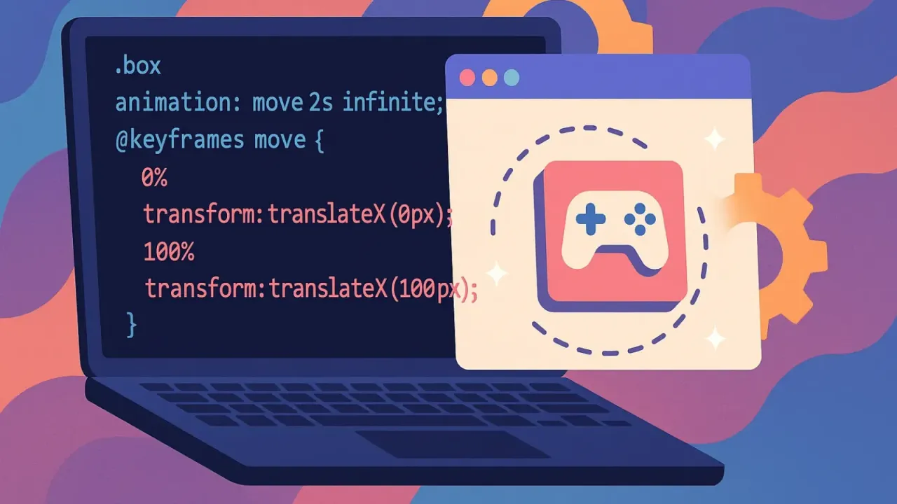
1. @keyframes (Animation Script)
Think of it as a movie storyboard that defines every key moment from start to finish:
@keyframes slideIn {
  0% {    /* Animation start: positioned left */
    transform: translateX(-100px);
  }
  100% {  /* Animation end: back to original position */
    transform: translateX(0);
  }
}
2. animation (Player Controls)
Like a video player control panel that decides how to play the animation:
.my-element {
  animation: slideIn 2s ease-in-out;
  /* Play slideIn animation for 2 seconds with ease-in-out timing */
}
7 Animation Control Parameters (Super Simple guides)
Think of CSS animation as a movie, where each parameter is a playback control button:
1. animation-name (Choose the Movie)
Purpose: Decide which animation to play Analogy: Like choosing which movie to watch on Netflix
animation-name: fadeIn; /* Select animation named fadeIn */2. animation-duration (Playback Duration)
Purpose: How long the animation plays Analogy: Is the movie 90 minutes or 180 minutes?
animation-duration: 3s; /* Play for 3 seconds */3. animation-timing-function (Playback Rhythm)
Purpose: The pace and rhythm of animation Analogy: Smooth playback, or slow start then fast?
animation-timing-function: ease-in-out; /* Slow start → fast middle → slow end */Common Options:
ease- Natural feel (default, like human walking rhythm)linear- Constant speed (like robot walking)ease-in- Accelerating (like car starting)ease-out- Decelerating (like car braking)ease-in-out- Perfect feel (most natural rhythm)
4. animation-delay (Delayed Playback)
Purpose: Wait a few seconds before starting Analogy: Scheduled playback function
animation-delay: 1s; /* Wait 1 second before starting */5. animation-iteration-count (Replay Count)
Purpose: How many times to play Analogy: Single playback or loop playback?
animation-iteration-count: 3;        /* Play 3 times */
animation-iteration-count: infinite; /* Loop infinitely */
6. animation-direction (Playback Direction)
Purpose: Forward, backward, or back-and-forth? Analogy: Movie playback direction
animation-direction: normal;           /* Normal playback */
animation-direction: reverse;          /* Play backwards */
animation-direction: alternate;        /* Forward→backward→forward... */
animation-direction: alternate-reverse;/* Backward→forward→backward... */
7. animation-fill-mode (End State)
Purpose: What should the element look like after animation ends? Analogy: After movie ends, freeze on opening or closing scene?
animation-fill-mode: none;      /* Return to original state */
animation-fill-mode: forwards;  /* Stay at animation end state */
animation-fill-mode: backwards; /* Immediately show animation start state */
animation-fill-mode: both;      /* Combine forwards and backwards */
Hands-On Practice: Three Super Practical Animation Examples
Example 1: Fade-In Effect (Most Basic)
Use Case: Make content appear elegantly
/* 1. Define animation script */
@keyframes fadeIn {
  from { opacity: 0; }    /* From transparent */
  to   { opacity: 1; }    /* To opaque */
}

/* 2. Apply to element */
.fade-in-text {
  animation: fadeIn 2s ease-out;
}
✨ Fade-In Effect Demo
Example 2: Slide-In Effect (Common for Cards)
Use Case: Make elements slide in from the side
@keyframes slideInLeft {
  from {
    transform: translateX(-50px);
    opacity: 0;
  }
  to {
    transform: translateX(0);
    opacity: 1;
  }
}

.slide-in-card {
  animation: slideInLeft 1.5s ease-out;
}
🎯 Slide-In Effect Demo
Example 3: Bouncing Button (Interactive Effect)
Use Case: Make buttons more attention-grabbing
@keyframes bounce {
  0%, 20%, 50%, 80%, 100% {
    transform: translateY(0);
  }
  40% {
    transform: translateY(-10px);
  }
  60% {
    transform: translateY(-5px);
  }
}

.bounce-button:hover {
  animation: bounce 1s ease-in-out;
}
🎪 Bouncing Button Demo
Left button triggers on hover, right button triggers on click
One-Line Solution! CSS Animation Shorthand Syntax
Don’t want to write so many lines? CSS provides super convenient shorthand syntax:
/* Full syntax (7 lines) */
animation-name: slideIn;
animation-duration: 2s;
animation-timing-function: ease-in-out;
animation-delay: 0.5s;
animation-iteration-count: 1;
animation-direction: normal;
animation-fill-mode: forwards;

/* Shorthand syntax (1 line) */
animation: slideIn 2s ease-in-out 0.5s 1 normal forwards;
Memory tip: name duration timing delay count direction fill-mode
Common Questions Answered
Q: What if animations aren’t smooth enough?
A: Use transform instead of changing width, height:
/* ❌ Slower */
@keyframes grow {
  from { width: 100px; }
  to   { width: 200px; }
}

/* ✅ Faster */
@keyframes grow {
  from { transform: scaleX(1); }
  to   { transform: scaleX(2); }
}
Q: How to avoid animations disrupting reading?
A: Respect user system preferences:
/* If user dislikes animations, disable them */
@media (prefers-reduced-motion: reduce) {
  * {
    animation: none !important;
  }
}
Q: Will animations lag on mobile?
A: Choose performance-friendly properties:
- ✅ Recommended:
transform,opacity - ❌ Avoid:
width,height,top,left
Golden Rules of Animation Design
1. Natural Timing
- Fast animations: 0.2s - 0.5s (button feedback)
- Medium animations: 0.5s - 1s (page transitions)
- Slow animations: 1s+ (emphasis effects)
2. Don’t Overuse
Principle: Animation is seasoning, not the main course!
- Only animate important elements
- No more than 3-4 simultaneous animations per page
- Animations should be purposeful (guides attention, provide feedback)
3. Consider User Experience
- Provide option to disable animations
- Avoid flickering or overly intense effects
- Test performance on slower devices
Next Steps: Start Creating!
Recommended Practice Steps:
- Start with fade-in effects - Simplest and most practical
- Try slide-in effects - Add dynamism to cards or images
- Create button hover effects - Enhance interactive experience
- Combine multiple animations - Create richer effects
⚡ Animation Timing Comparison
Remember: The best way to learn is by hands-on practice! Don’t be afraid of making mistakes - every professional frontend developer started with simple fade-in animations.
Now open your code editor and bring your first CSS animation to life! 🎬✨